A Vision for Safety: The Definitive Guide to High-Contrast Bathroom Design for Vision Loss

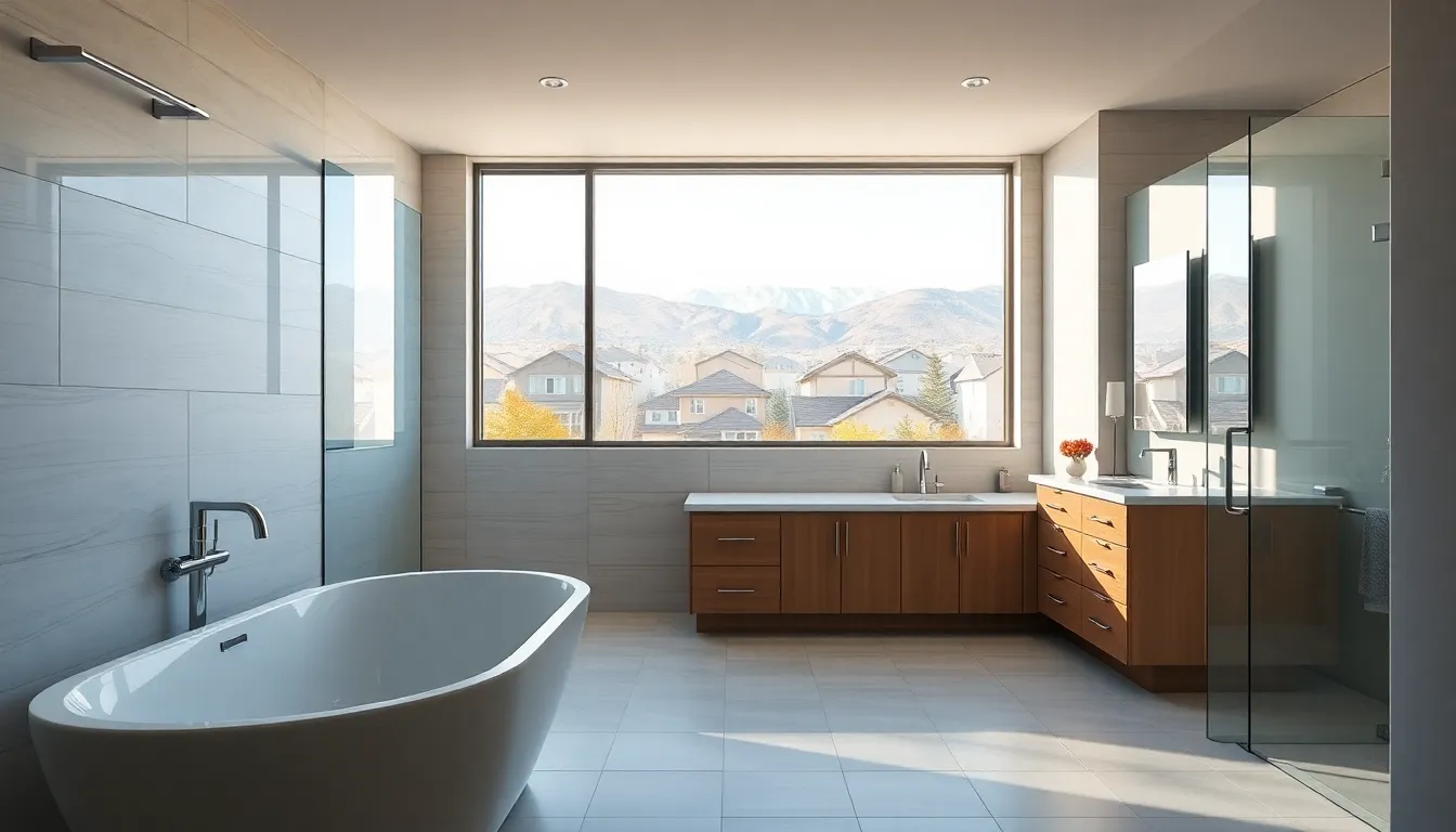
Transforming one of the home's most hazardous rooms into a sanctuary of safety and independence through the power of deliberate design.
The bathroom presents a unique set of challenges for everyone, but for individuals with vision loss—whether from macular degeneration, glaucoma, diabetic retinopathy, or other conditions—it can be the most dangerous room in the house. Slippery surfaces, poor depth perception, and difficulty distinguishing features create a perfect storm for accidents. The solution, however, is not just about adding grab bars; it's about fundamentally rethinking the visual landscape of the space. This is the core of accommodating vision loss: high-contrast design principles for bathroom safety are paramount.
This comprehensive guide explores how leveraging contrast, color, and light can dramatically enhance bathroom safety, promoting confidence and independence without sacrificing style. By making key elements easier to see and identify, we can reduce the risk of falls and create a space that is truly accessible for everyone.
Understanding the "Why": How High Contrast Aids Vision
For a person with low vision, the world can often appear washed out, with edges blending together. High-contrast design works by making objects "pop" from their background, providing the brain with clear visual cues to distinguish different surfaces, levels, and fixtures. It's about creating clear visual boundaries.
The key metric for this is Light Reflectance Value (LRV), a measurement from 0 (absolute black) to 100 (pure white) that indicates how much light a color reflects. For optimal visibility and safety, accessibility experts recommend a difference of at least 70 points between the LRV of adjacent surfaces (e.g., floor and toilet base, or grab bar and wall). This scientific approach to color selection is a cornerstone of effective and safe design for those with visual impairments.
The Core Principles: A Practical, Zone-by-Zone Breakdown
Applying these high-contrast strategies requires a thoughtful approach to every surface and fixture. Here’s how to implement these life-saving design principles throughout the bathroom.
The Foundation: Floors, Walls, and Doorways
The largest surfaces set the stage. The primary goal is to clearly delineate the floor from the walls to aid in orientation and balance.
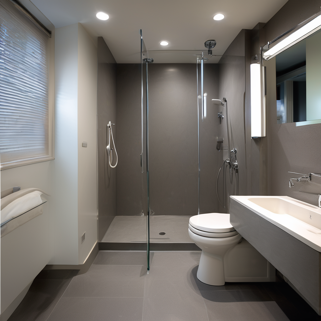
- Floor vs. Wall: Choose a floor finish that is significantly darker or lighter than the walls. A dark, matte-finish, non-slip tile floor (low LRV) paired with off-white walls (high LRV) is a classic, effective combination.
- Wall vs. Fixtures: The toilet and sink should stand out against the wall color behind them. A white toilet against a medium-gray or blue wall is much more visible than a white toilet against a beige wall.
- Doorway Definition: Paint the door and its frame a color that contrasts sharply with the adjoining wall to make the entrance and exit unmistakable.
The Critical Zone: Toilet and Grab Bars
Navigating to and using the toilet is a major safety concern. Contrast is non-negotiable here.
- Toilet Seat: The toilet seat should contrast with the bowl. A black or dark-colored seat on a white toilet provides a clear target.
- Toilet and Floor: The entire toilet unit must be distinct from the floor. Avoid a white toilet on a light-colored floor.
- Grab Bars: This is arguably the most critical application. Grab bars must have a high-contrast finish compared to the wall tile. A brushed nickel or matte black grab bar on light tile, or a white grab bar on dark tile, is essential for quick, confident location in an emergency.
The Wet Zone: Shower and Bathtub Safety
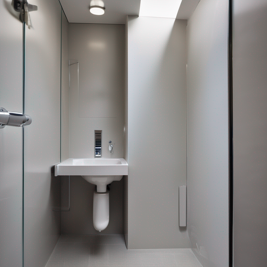
The combination of water and low visibility makes the shower a high-risk area. A key aspect of an accessible bathroom renovation is ensuring this space is visually clear.
- Shower Floor: The shower floor or tub basin should contrast with the bathroom floor to clearly mark the change in area, especially for zero-threshold or walk-in showers.
- Controls and Fixtures: The shower valve, handle, and showerhead should be in a finish that contrasts with the shower wall tile. Matte black, oil-rubbed bronze, or even vibrant brushed gold can be excellent choices against light tile.
- Visual Edges: Use a contrasting tile border around the shower area or a contrasting color for the shower curb to clearly define its perimeter.
Beyond Color: Lighting and Texture
Effective design for visual impairment isn't limited to color. Strategic lighting and tactile cues provide another layer of safety.
The Power of Glare-Free, Layered Lighting
Good lighting is a form of contrast. The goal is bright, even illumination without creating glare, which can be painful and disorienting for those with light sensitivity. Use a layered approach:
- Ambient Lighting: Bright, central overhead fixtures (like a flush-mount LED) to illuminate the entire room.
- Task Lighting: Sconces or a backlit mirror at the vanity to provide clear, shadow-free light for grooming.
- Night Lighting: Low-wattage LED strips under the vanity toe-kick or motion-activated night lights to provide a safe pathway for nighttime use.
Your Questions Answered: High-Contrast Bathroom FAQs
Does a high-contrast bathroom have to be black and white?
Absolutely not! While black and white offers the maximum possible contrast, you can achieve excellent, safe results with a rich color palette. The key is focusing on the Light Reflectance Value (LRV) difference. A deep navy blue (low LRV) paired with a warm cream (high LRV), or a dark forest green against a light grey, can be both beautiful and highly effective. The goal is visual separation, not a specific color scheme.
What is the single most important element to get right for contrast?
If you can only focus on one thing, make it the grab bars. In a moment of slipping or imbalance, a person needs to locate and grab the bar instantly. If it blends into the wall, its purpose is defeated. A grab bar that contrasts sharply with the wall surface is the most critical safety feature in an accessible bathroom.
Is this type of design only for people with significant vision loss?
Not at all. High-contrast design is a core principle of Universal Design, meaning it benefits everyone. As we age, our eyes naturally require more light and higher contrast to see clearly. Furthermore, anyone stumbling into the bathroom in the middle of the night or in a steamy, low-light environment will find it easier and safer to navigate a high-contrast space.
Can a high-contrast bathroom still feel luxurious and modern?
Yes, 100%. High-contrast design is a staple of modern and luxury aesthetics. Think of a spa-like bathroom with dark slate floors, crisp white walls, a rich walnut vanity, and bold matte black fixtures. This is a perfect example of a design that is both incredibly stylish and inherently accessible. Safety and high-end design are not mutually exclusive; they can and should coexist.
Have Questions About Your Bathroom or Remodeling Project?
Talk to our licensed Utah specialists about layout, ADA compliance, or custom renovations.