Universal Design Masterclass The Art of Seeing and Feeling: A Guide to Texture and Color Contrast in Accessible Bathrooms

For decades, the term "accessible bathroom" conjured images of sterile, clinical spaces defined by function over form. It was a world of cold chrome and stark white, a landscape of compliance rather than comfort. But a quiet revolution is underway, one that reclaims accessible design as the pinnacle of thoughtful, human-centric architecture. At the heart of this movement are two of design's most powerful tools: texture and color contrast. This is not just about meeting standards; it's about creating environments that are intuitively safe, effortlessly usable, and profoundly beautiful for everyone.
This guide will explore how to use texture and color contrast to create a beautiful and safe accessible bathroom. We’ll move beyond the basics and delve into the science and artistry of crafting a space that delights the senses while providing an unparalleled level of security and independence.
The Dual Imperative: Why Contrast is Non-Negotiable
In a bathroom, where wet surfaces and complex navigation are standard, clarity is paramount. For individuals with low vision, age-related visual decline (like macular degeneration or cataracts), or certain cognitive differences, the ability to distinguish between surfaces isn't a luxury—it's essential for preventing falls.
- Visual Cues: Strong color contrast acts as a natural wayfinding system. It clearly defines the boundary between the floor and the wall, highlights the location of a grab bar, and makes the toilet and vanity easy to locate.
- Tactile Feedback: Texture provides information through touch. A change in flooring texture can signal the transition into a wet area like a curbless shower. The grip of a knurled grab bar or a matte-finish tile provides physical reassurance and stability.
When you master the interplay of these elements, you create a space that feels inherently safer and more comfortable, not just for those with accessibility needs, but for every user.
Mastering Color Contrast: The Foundation of Visual Safety
Effective color contrast is more science than art. The key metric is the Light Reflectance Value (LRV), which measures the amount of visible light a color reflects. LRV runs on a scale from 0 (absolute black) to 100 (pure white). For accessibility, the goal is to have a significant point difference between adjacent functional surfaces.
Key Contrast Zones and Strategies:
- Floor vs. Wall: This is the most crucial contrast point. A dark floor and a light wall (or vice-versa) clearly define the room's dimensions and prevent disorientation. A 30-point LRV difference is a good benchmark.
- Grab Bars vs. Wall: A chrome grab bar on a white tile wall is a classic design failure; it can become nearly invisible in certain lighting. Opt for grab bars in finishes like matte black, oil-rubbed bronze, or even a vibrant color against a light-colored wall for maximum visibility.
- Toilet vs. Floor/Wall: The toilet should stand out. If you have a light floor and wall, a standard white toilet can disappear. Consider a colored toilet seat or ensure the fixture is positioned against a contrasting accent wall.
- Countertop vs. Vanity: Differentiating the edge of the countertop from the vanity base below helps with spatial awareness and stability when leaning.
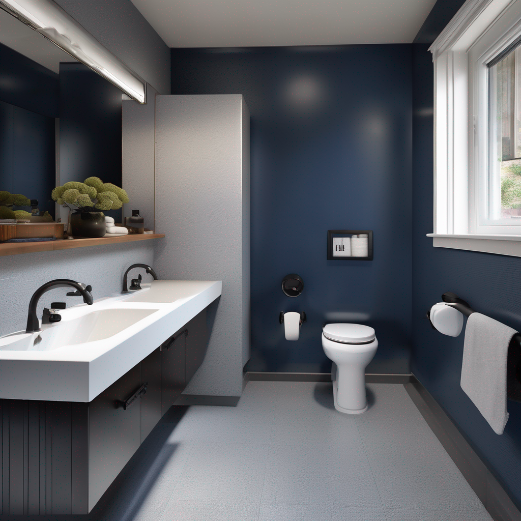
Sophisticated palettes can easily achieve these guidelines for creating a safe and stylish accessible bathroom using color contrast. Think of a deep navy blue wall (low LRV) with a warm off-white vanity (high LRV) and brushed brass fixtures that provide both visual contrast and warmth.
Harnessing Texture: The Unsung Hero of Tactile Safety
While color guides the eyes, texture guides the body. In a bathroom, where surfaces are often wet, the right texture is your first line of defense against slips and falls. This is where we discuss the best non-slip bathroom flooring that is also beautiful.
Tactile Zoning for Intuitive Navigation:
Think of your bathroom floor in zones, each with a specific textural need:
- The Wet Zone (Shower): This area demands the highest grip. Small-format tiles (like mosaics or penny rounds) are excellent because the increased number of grout lines creates more friction. Alternatively, look for large-format tiles with a high DCOF (Dynamic Coefficient of Friction) rating and a matte or textured finish.
- The Dry Zone (Main Floor): Here you can use a slightly less aggressive texture, but it must still be rated for wet environments. Materials like matte-finish porcelain, luxury vinyl tile with an embossed texture, or natural stone like honed slate are superb choices.
- Transitions: Use tactile cues to signal a change, especially for curbless showers. A strip of contrasting, highly textured tile at the shower entrance can provide a clear signal to a user with low vision or someone navigating with their feet.
Understanding how texture in bathroom design prevents falls is about more than just the floor. A wooden vanity offers a warmer, more welcoming tactile experience than cold laminate. A knurled metal grab bar provides a more secure grip than a smooth, polished one. Every surface is an opportunity to enhance the safety and sensory richness of the space.
Frequently Asked Questions
What is LRV and why does it matter so much for an accessible bathroom?
LRV stands for Light Reflectance Value. It's a measurement on a scale of 0 to 100 that indicates how much light a color reflects. A value of 0 is absolute black (absorbing all light), and 100 is pure white (reflecting all light). It matters immensely in accessible design because the human eye perceives edges and objects through differences in light and shadow. For people with visual impairments, a strong difference in LRV between two surfaces—like a floor and a wall, or a grab bar and the tile behind it—is what makes those elements distinct and navigable. A recommended 30-point difference in LRV between key elements is a foundational principle for creating a visually safe environment.
Can a beautiful, high-end bathroom *really* be fully accessible?
Absolutely. This is the core principle of modern universal design. Accessibility is not an "add-on"; it's a feature of good design. Today's market is filled with stunning, design-forward products that are inherently accessible. Think of sleek, matte black grab bars that double as towel racks, elegant curbless showers with integrated linear drains, floating vanities that allow for wheelchair access, and beautiful, high-friction porcelain tiles that look like natural wood or stone. By integrating the principles of color and texture contrast from the beginning, an accessible bathroom can be the most luxurious and beautiful room in the house.
Are dark-colored floors a good idea for bathroom safety?
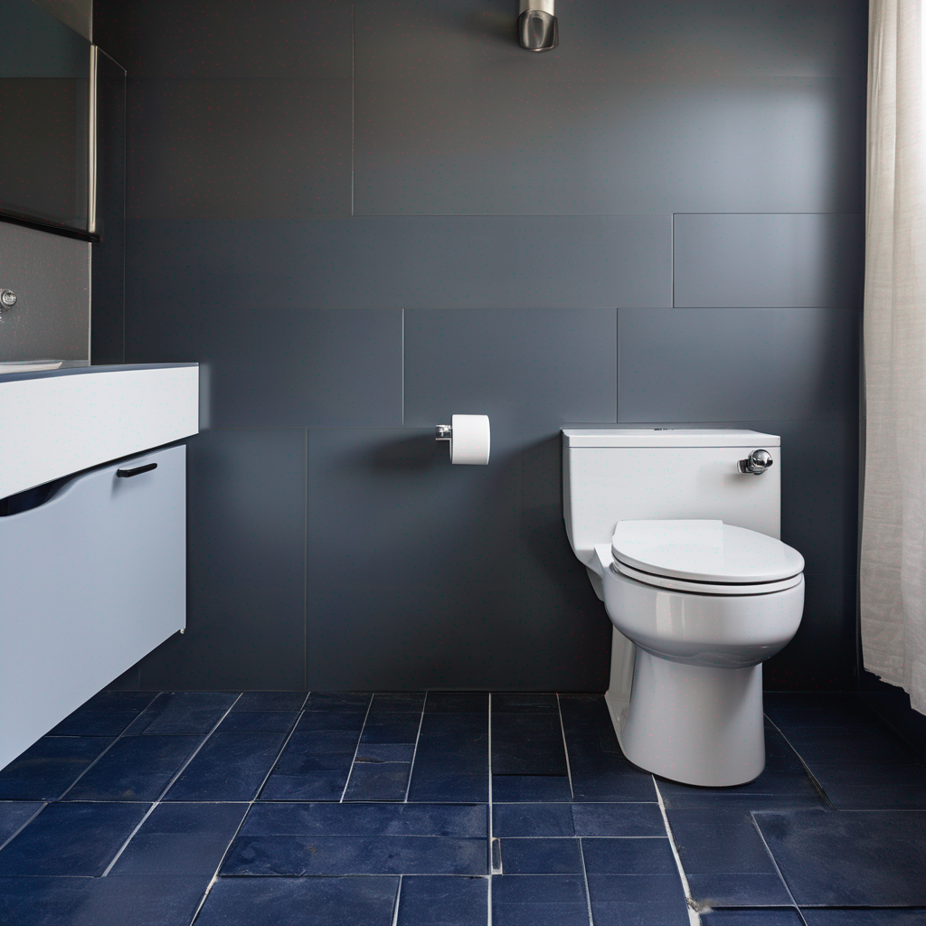
Yes, dark floors can be an excellent choice, provided they are used correctly within a high-contrast design scheme. A dark floor (e.g., charcoal, slate, or espresso-colored tile) paired with light-colored walls creates a very strong visual foundation for the room, which is great for spatial awareness. The key is to ensure the texture is non-slip (matte, riven, or sandblasted finishes are ideal) and that the toilet and any bathmats provide strong visual contrast against the dark floor. A white toilet on a dark gray floor, for instance, is much easier to see than a white toilet on a beige floor.
How do I choose grab bars that are safe but don't look clinical?
The market for designer grab bars has exploded. To avoid a clinical look, first, move beyond polished chrome. Consider finishes that match your other fixtures, like matte black, brushed nickel, oil-rubbed bronze, or brushed brass. Second, look for bars with more refined shapes—sleek, straight lines or gentle curves. Some high-end brands offer grab bars with added texture or "knurling" for better grip, which also adds a sophisticated, industrial-chic look. Finally, many companies now produce multi-function products, such as a grab bar integrated into a toilet paper holder or a shelf, which seamlessly blends safety into the room's overall design.
Design for Life
Creating a truly accessible bathroom is an investment in quality of life. By thoughtfully applying the principles of texture and color contrast, you can build a space that transcends mere compliance and becomes a sanctuary of safety, dignity, and style. It's not about designing for disability; it's about designing for humanity.